
Red Light, Green Light: Should Food Labels Be Like Traffic Lights?
It’s a tired refrain: “It’s all about consumer choice, we can’t limit choice, the consumer is king.” Every time some pesky public health advocate wants to try to reform the food environment, the industry starts to shriek about limiting choices and taking away people’s freedom. New York City’s attempt to remove “bucket” as an acceptable size for sugary drinks is probably the most prominent example of this playing out, but it happens all the time:
Mountains of research indicate that if nothing is done to change our food environment, obesity and chronic disease will continue to rise, leading to unsustainable burdens on health care systems and economies worldwide.
Health experts respond by attempting to enact policy-level improvements, like adjusting prices of worse-for-you foods to better represent the costs to consumers and society; or enacting limits on marketing practices that push unhealthy foods onto vulnerable populations.
But when these policies come to a vote, the industry spends millions on lobbyists who shout: “Consumers need education, not government meddling!” Bordering on religious devotion, this concern for the interests of the well-informed consumer would be almost admirable, were it not so glaringly inconsistent.
There are simple ways to inform consumers about the healthfulness of foods, but the industry tends to resist these, even though research has shown them to be effective and preferred by the consumers themselves.
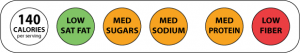
Yet another study recently showed that a simplified, color-coded food label indicating the healthfulness of a product would benefit consumers. Swiss researchers used eye-tracking technology to compare the efficiency of three different front-of-package (FOP) labels:
1. Traffic-Light System
Traffic-Light (TL) labels contain red, green, or yellow marks to indicate whether a food has high low or moderate levels of ingredients to encourage or avoid. For example, high levels of fiber would get a green label, and high levels of sugar would get a red label.
2. The Guidelines of Daily Amounts
The Guidelines of Daily Amounts (GDA) is similar to the Industry’s own Facts-up-Front labels, which display numbers indicating calories, saturated fat, sodium, and sugar, but do not provide guidance as to whether any these amounts are healthful or not.
3. The Nutrition Table
The Nutrition Table was simply a table listing ingredients and their amounts, similar to the nutrition facts labels currently on the backs or sides of packaged foods today, though a much more simplified version.
Participants viewed foods with these different labeling systems and then were asked to rate the healthfulness of the foods. The results indicated that both the GDA and the Traffic Light labels provided more information to consumers, but the TL format required less processing time.
Another study out of Yale identified advantages to the traffic light system, finding that consumers actually preferred it to the industry’s Facts-up-Front system, and the more accurately identified certain measures of products’ healthfulness.
In 2012 I produced a video describing the study while interning at the Yale Rudd Center for Food Policy & Obesity:
Simple, color-coded labels like the traffic light system would help consumers, and consumers have indicated that they prefer something like this. So why doesn’t the food industry adopt the system? Well, based on their fight against the recent attempt to include added sugars on back-of package nutrition labels, it’s a safe bet that the food industry does not want consumers to realize just how unhealthy most of the foods they are buying truly are.
As A Consumer, What Would Help You Make Better Food Choices?
Do you have a passion for nutrition & natural healing?. Learn more about the Food Matters Nutrition Certification Program here.